In the latest release of cBioPortal, we have implemented the option to split samples into groups in the genomic evolution plot that is part of the patient view. This will allow researchers to discern trends that only occur in samples with certain properties. For example, if a patient has sequencing results from both tissue and blood samples, there may be trends that are only visible in the blood samples. Having both sample types in one diagram may hide this trend. In this blog post, we will illustrate how this works by guiding you through an example. This work was sponsored by AstraZeneca.
What is the problem?
By taking multiple samples over time from a patient, we can see how the disease develops over time. This will allow us to see if and how a patient is responding to treatment or if subclones are appearing or becoming more dominant. cBioPortal supports users with this use case by showing allele frequencies over time in the patient view, shown below.
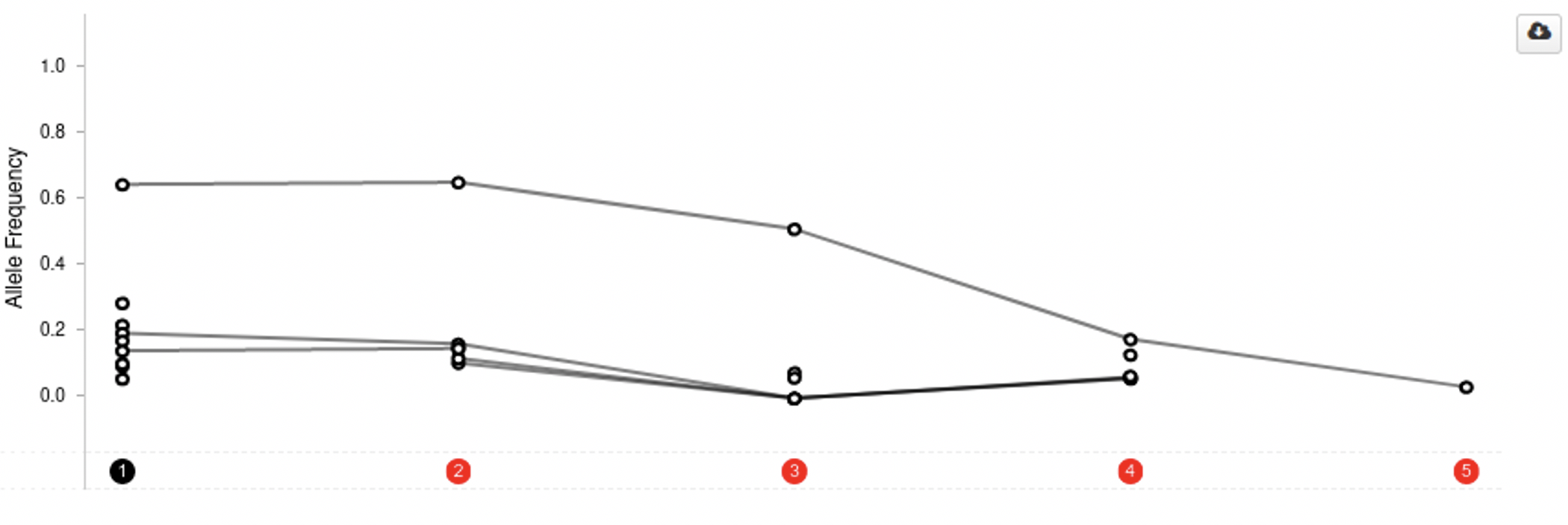
The concept is simple: the samples go on the x-axis and allele frequency on the y-axis and each dot represents the allele frequency for a gene in a sample. Measurements for the same gene are connected by a line, to allow the user to see trends.
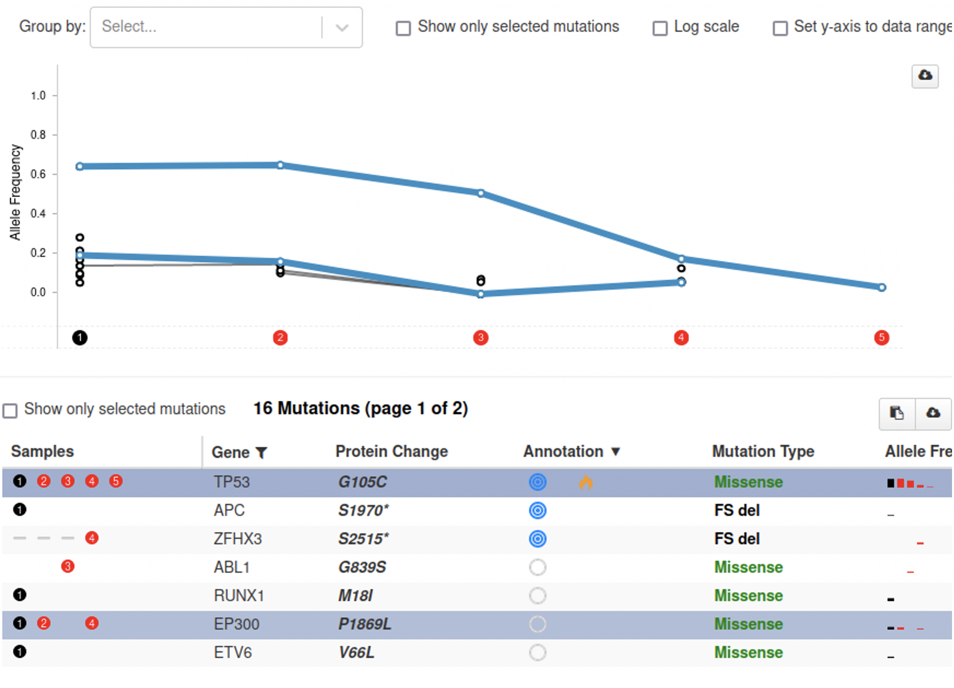
From just the plot it is hard to see what happens exactly. To make this easier, the plot is connected to the table below. A user can hover over a row in the table to highlight the corresponding line in the plot and vice versa. By clicking a line or a row in the table, it is also possible to permanently highlight them, as shown below.
There are situations where this feature is less useful however. If a patient has multiple samples that cannot reliably be compared to each other, these trends can become hidden. This can happen when the samples are taken from different sources (primary tumor, metastases, blood) but also when they are processed in different ways or by different labs.
Let’s have a look at our solution, illustrated by an example case that is available in the public cBioPortal!
Example: tracking variant allele frequency(VAF) in multiple sample types
For this example, we need a patient for which we have multiple samples taken over time. A patient that nicely illustrates the utility of this feature is this one. Without grouping the samples and when highlighting the mutation in TP53, the genomic evolution plot looks like this:
Based on this image, you would say that the VAF for the TP53 mutation decreased in the beginning, increased back to the same level, then made a steep drop for sample 5 and bounced back in sample 6.
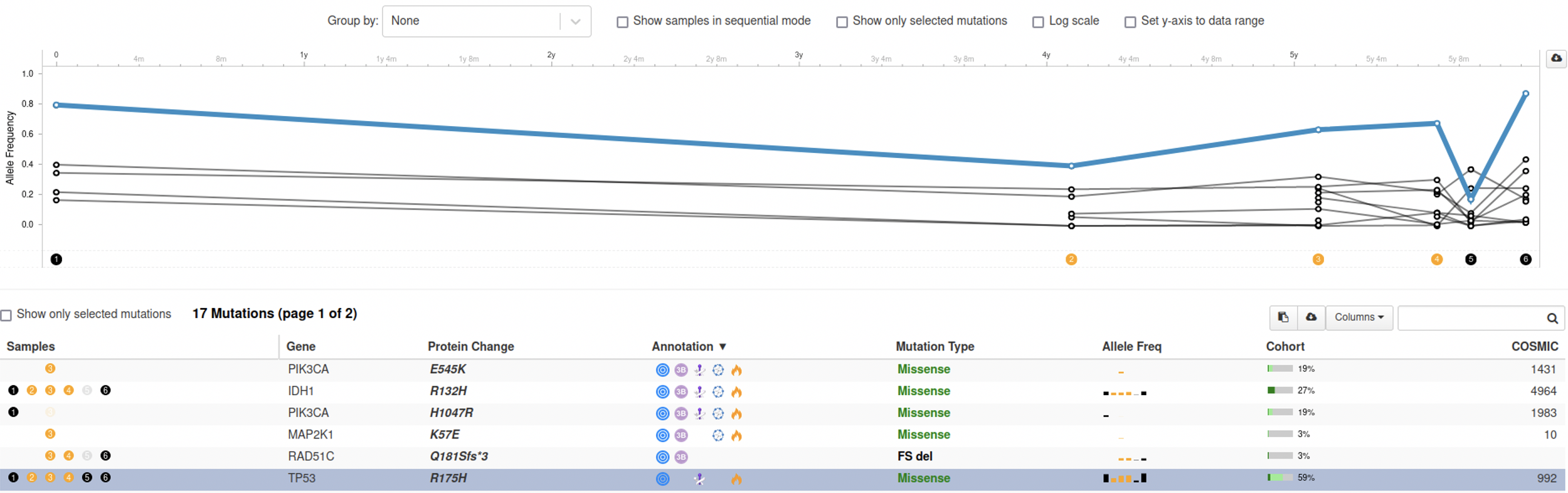
Now let’s use the new ‘Group by’ function by selecting ‘Sample Collection Method’ from the dropdown menu and see what happens:

Now things look very different. There is no dip in the VAF for the mutation in TP53 at sample 5 at all. It turns out that samples 5 and 6 are liquid biopsies, while samples 1-4 are tissue samples. This means that both the biological source of those samples and the methods for processing them are different and they cannot be compared to each other.
As liquid biopsies will become more and more common, we can expect cases where we may have tens of cfDNA samples over time mixed with tissue samples. Imagine that in this example we would also have taken blood samples in between the tissue samples. Without being able to group the samples based on their collection method the plot would be impossible to interpret. The group by feature solves this problem.
Closing remarks
The Hyve provides services to develop, extend and improve features in cBioPortal, such as the one described in this article. Implemented features are released to the community via the cBioPortal repository on GitHub. We hope you like this new feature and it proves useful in your work. Many thanks to AstraZeneca for sponsoring this work. For inquiries on cBioPortal feature development projects or other services around cBioPortal, feel free to contact us.


