The RADAR-base platform collects a wealth of sensor data from smartphones and wearable devices. User-friendly and highly adaptable data visualisations help scientists to analyse the data at individual participant level or at study level.
RADAR-base enables scientific research with data from Android smartphones and a range of wearable devices. The open-source platform, launched this spring, builds on experience gained in the RADAR-CNS project, a public-private project funded by the Innovative Medicines Initiative (IMI). Since 2016, The Hyve has been actively participating in RADAR-CNS.
The RADAR-base visualisation tool was developed in collaboration with partners from King’s College London and lntel. Other parties that have been involved in the development of RADAR-base include the University of Freiburg, Janssen Pharmaceuticals, Lundbeck, Lygature and Vibrent Health.
In this blog, we’ll highlight the most important visualisation features, especially the ones that support the analysis of data collected in remote monitoring studies with wearable devices.
Study view
Once logged in, the user can navigate to view details of a study of their interest from the home page.
The “study view” gives an overview of the number of participants in a particular study and the wearable devices and applications assigned to the participants. It shows if the devices are actively contributing data or, when inactive, the last time they submitted data. This allows close monitoring of participant’s compliance and provides researchers with the information to prevent data loss due to disconnection of devices that passively send data.
When questionnaires are used to actively contribute information about mood or severity of symptoms of participants, the dashboard will provide visualizations to determine how many of the scheduled questionnaires have been filled at specified time points.

Subject view
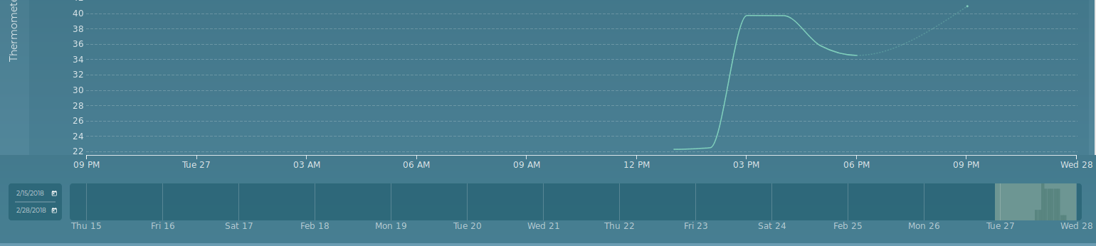
The user can select individual participants from the study view to visualize the collected data from that participant from multiple sensors. The user can specify the data collection timeline as well as the granularity of aggregated values such as seconds, minutes, hours or days.
The figure below shows a subject view displaying data from a participant called ‘BioIT-Demo-patient’, included in the ‘BioIT-Demo’ study. This person collected data for 8 hours on a single day. In a real study, data will of course be collected for weeks, months or even years.

The subject view shows graphs for all applicable sensors for the selected participant. In this case, a smartphone provided accelerometer data and data on the energy level of the battery. An Empathica E4 wristband collected accelerometer and battery data too, besides measuring electrodermal activity, body temperature, and blood volume pulse and interbeat interval (to measure the heart rate).
The bar at the bottom of the page, the “Volume bar”, provides information for which period data is available and the amount of data collected over that period. This can help decide which time frame could be of interest for further analysis and if enough data is available for that period. By highlighting part of the volume bar the user selects the displayed timeline of the sensor data graphs. The graph supports one or multi-dimensional data e.g. accelerometer and temperature.
Adjusting the subject view
The subject view dashboard is extremely user-friendly and adaptable. It allows users to zoom in and out on the data using period, interval. Further various statistical representation of data can be selected to analyse.
1. Period selection
The user can select a period of interest to be viewed on the volume bar by entering a start and end date on a calendar. In addition, the displayed timeline on the graph can be shortened or extended by dragging the boundary lines left or right on the volume bar, highlighting the displayed time. Once the displayed timeline is adjusted the graphs reload with sensor data corresponding to the selected timeline.

2. Interval and representation selection
After selecting a period of interest as the displayed timeline, the user can further zoom in by displaying aggregated data at a number of intervals. Available resolutions are shown at the top right corner of the page, such as 1 day, 1 hour or 10 minutes. Selecting a different interval automatically loads relevant data and reloads the graphs.
Next to the interval resolutions is a field where the user can change the statistical representation of the data. By default the graphs are plotted based on median values. Other representations include maximum, minimum and sum.

For example, the figure above displays the aggregated Median values for every minute for all sensor data.
3. Enabling and disabling parameters
The RADAR-base visualisation tool also allows the user to view only a selection of sensor data for a particular participant. By clicking on a sensor parameter (e.g. the accelerometer data for the smartphone) from the listed sensors in the left top column of the page, the graph can be enabled or disabled. This feature is helpful when for example the user wants to make a good comparison of the accelerometer readings from smartphone and smartwatch as shown in the figure below where only the “ACCELEROMETER” from both phone and the Empatica E4 are enabled.

Conclusion
The graphic representations of data in RADAR-base is a powerful addition to the platform. It not only makes it easier to detect correlations between various parameters, but also also shows at a glance when the data is collected from the wearable device or the smartphone and the quality of the sensor data. It allows fast detection of suboptimal compliance and therefore provides options to intervene by getting in touch with participants. The visualization tool is also integrated with RADAR-Base platform’s user management system to support secured and authorized data visualization, allowing only authorized users of a particular study to view data.
Contact us
If you want to use RADAR-base in your research, contribute to the platform development, or just want to learn more about the project, please do not hesitate to contact us. The Hyve welcomes any feedback on the visualisation tool in particular or the RADAR-base platform in general.
Please read our blog post on how to get started with the platform by setting up a study and do participant enrolment.
Funding statement and Disclaimer
The RADAR-base developed under RADAR-CNS project has received funding from the Innovative Medicines Initiative 2 Joint Undertaking under grant agreement No 115902. This Joint Undertaking receives support from the European Union’s Horizon 2020 research and innovation programme and EFPIA.
This communication reflects the views of the RADAR-CNS consortium and neither IMI nor the European Union and EFPIA are liable for any use that may be made of the information contained herein.


